Building a visual identity for your on-demand mobility service
Spare Product Design Lead Jason Miller shares his tips for designing a marketable microtransit, paratransit or ridehailing brand.

A good visual identity helps riders understand instantly what you’re all about. Whatever makes you special, it should be reflected in the name you choose, the imagery you use, and the way you talk about your service.
If you’re launching an entirely new mobility service, that probably means highlighting why people should ride with you instead of with familiar alternatives like Ubers and taxis. Maybe your drivers are really nice people, or your vehicle fleet is all-electric, or maybe you’re just more affordable.
If you’re introducing an on-demand service to an existing transportation system, emphasizing your specialness probably means explaining how an on-demand ride is different from a regular bus ride. You might want to highlight how on-demand can provide faster service, more direct travel, or a convenient connection to transit hubs.
At Spare, we support our partners throughout their entire onboarding journey, which includes lending a helping hand when it comes to branding their microtransit, paratransit or ride hailing service. Here are the five things you should keep in mind when creating your brand:
1. Stick to your strengths!
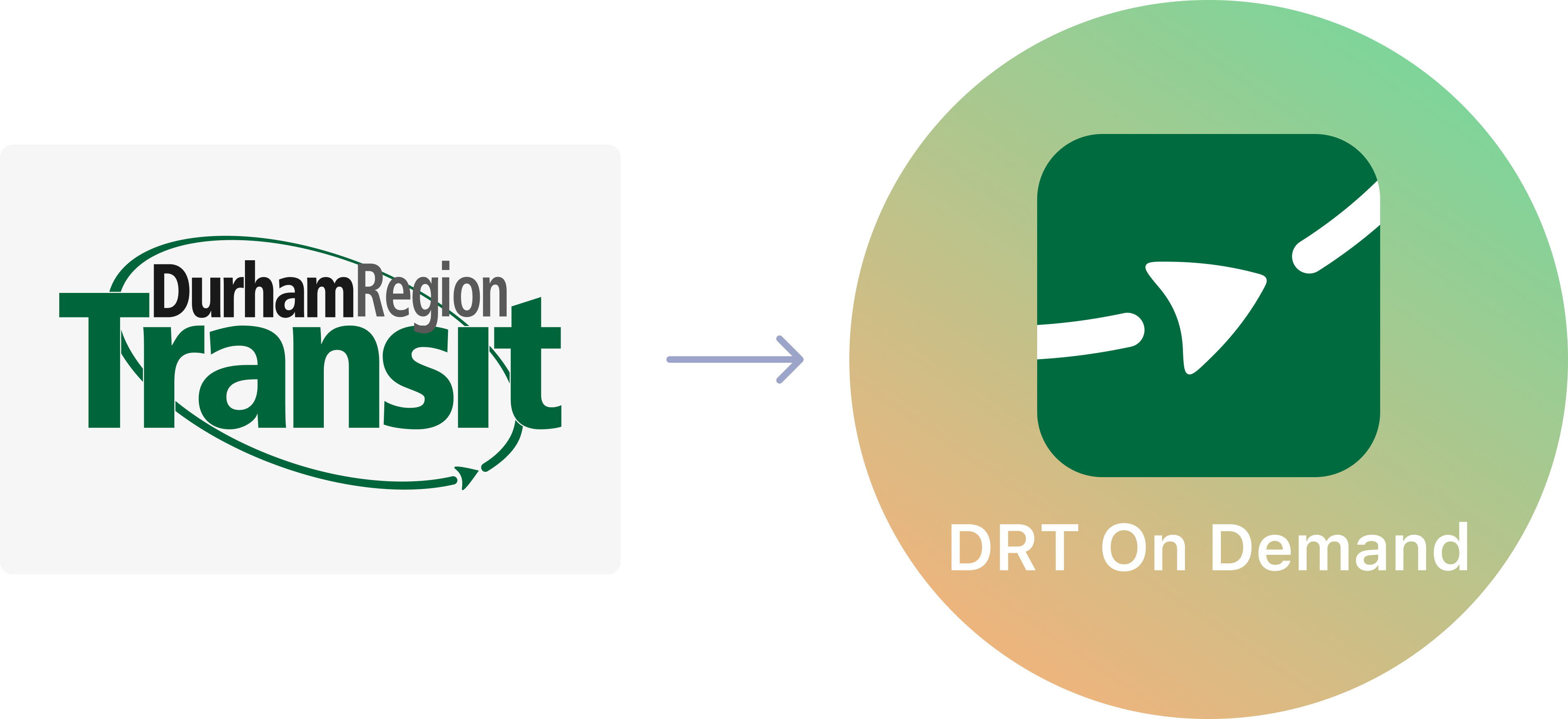
If you’re a transit agency and you already have a fixed-route brand that riders know and love, then the branding of your on-demand service should feel like a new member of a family they already know.
Mix familiar elements with one or two new elements, so your riders understand that it’s a new offering that’s part of a network they already trust. If your fixed-route bus service has a blue logo with orange accents, your on-demand program could swap the colors and use an orange logo with blue accents.
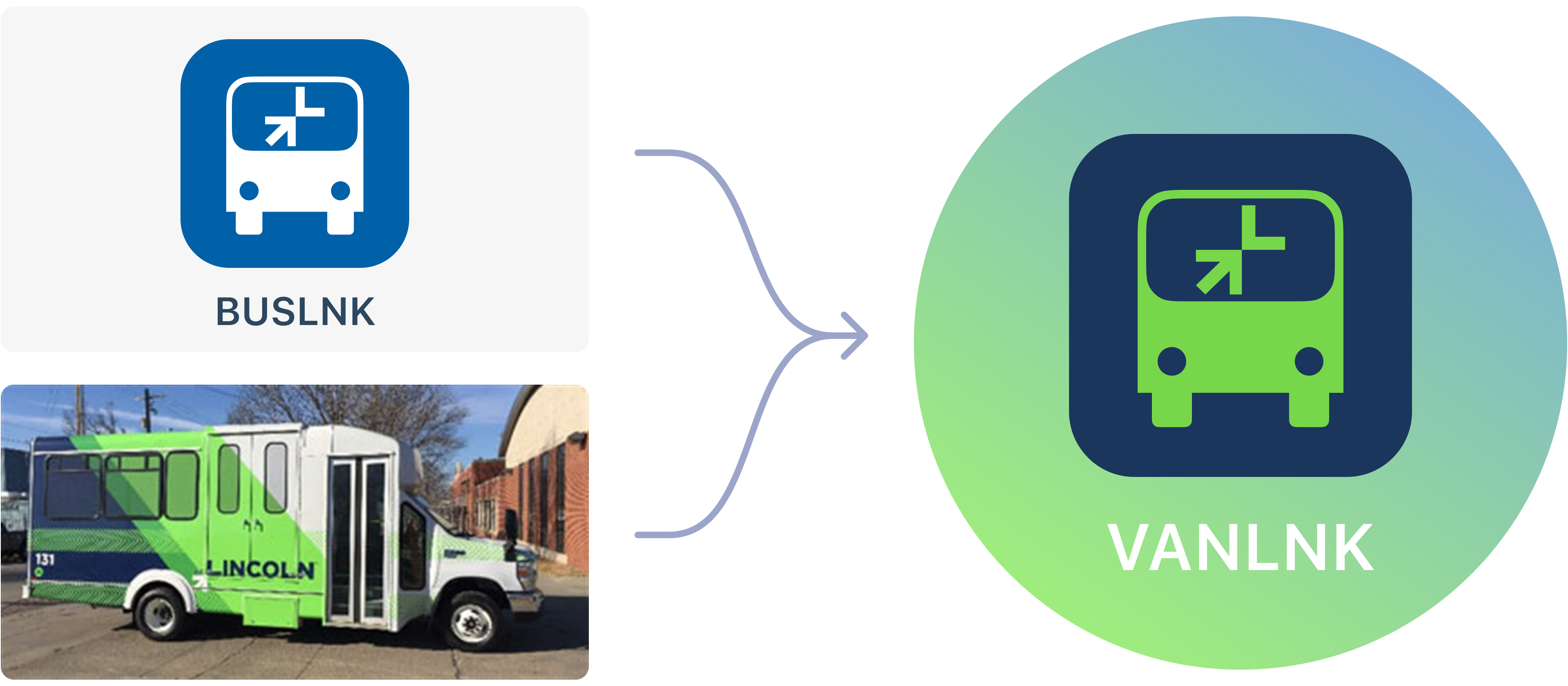
One real-life example: The city of Lincoln, Nebraska already had an app for browsing bus schedules called BUSLNK and another app called UPLNK for reporting civic maintenance issues. We built on this naming scheme with the new VANLNK on-demand service, combining the existing BUSLNK icon with the existing blue and green color scheme from the smaller vehicles they planned to use.
2. Stand out from the crowd
Think about what your service offers that no one else does. Is there a way you can highlight that in your logo? For instance, if you’re a ride hailing company focused on zero-emission rides, can you incorporate that aspect into your branding?
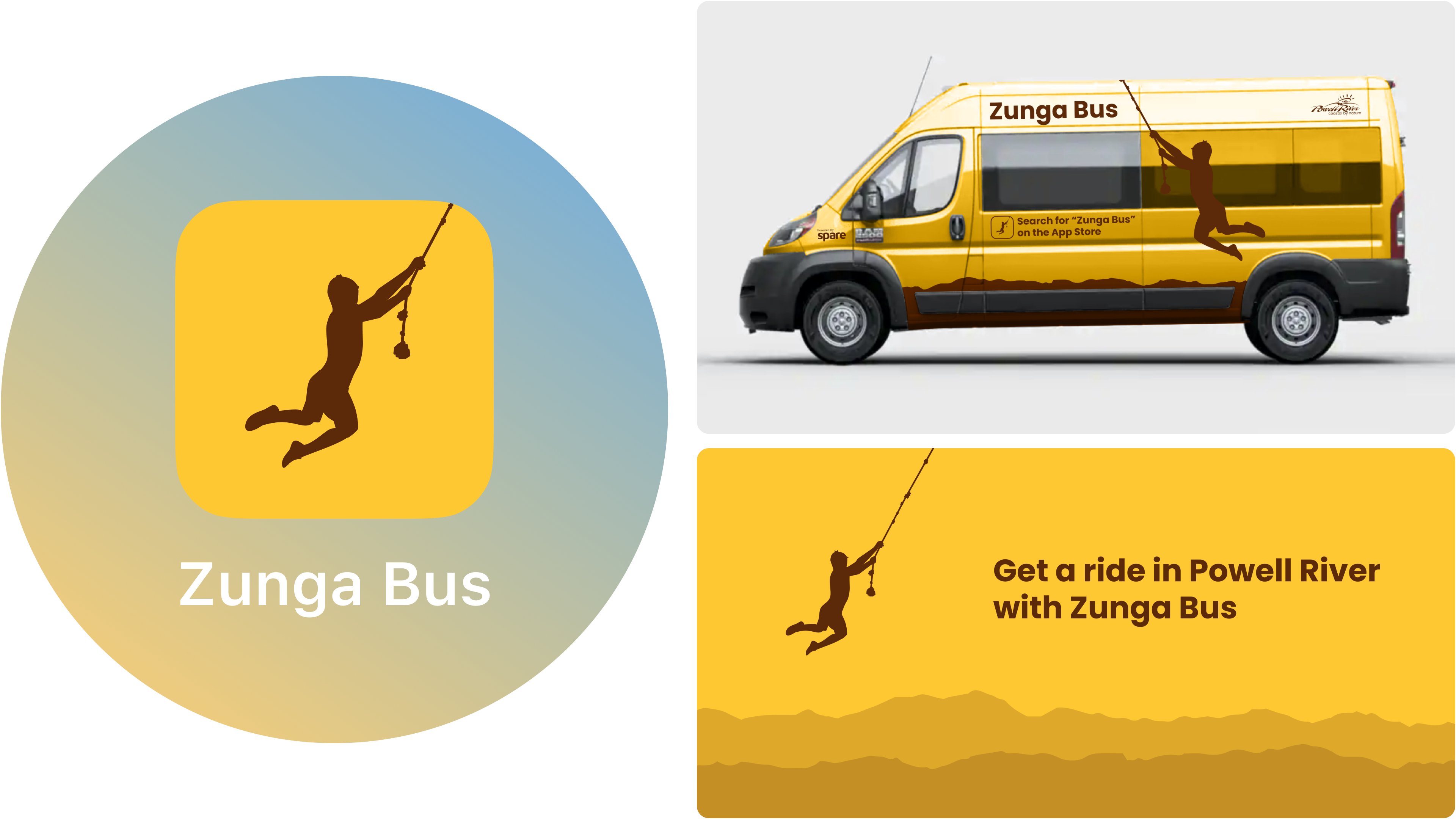
If you’re worried about being too generic with your branding, you can focus your efforts on something that’s unique to your city or region. Zunga Bus in Powell River, British Columbia is a perfect example of this. To an outsider, the word “zunga” might not mean much, but for locals it means a make-shift rope swing that arcs over a body of water, and it’s instantly recognizable. The accompanying logo depicting a young person swinging on a rope helps the service create a sense of place and belonging for its riders.
3. Don’t overdo it
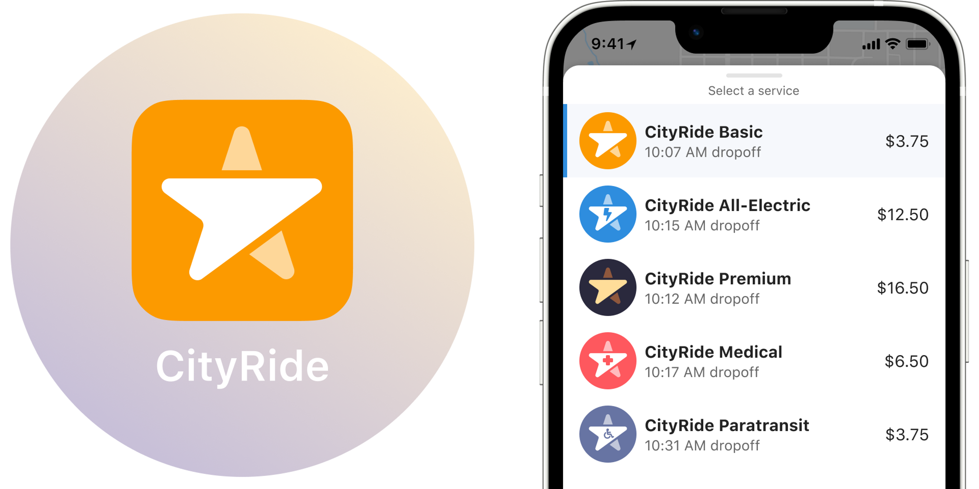
When riders open up your app, they need to be able to quickly understand which service is right for them, particularly if you offer several different options. While it may be tempting to create entirely new identities for your paratransit, microtransit, non-emergency medical transit and whatever other services you choose to offer, make sure riders can tell how services are different and how they are the same. A clear naming scheme can really help - use common descriptive words like Express, Premium, Basic, Para, or Medical to help riders understand what each service offers.
4. Be consistent
Your logo is going to show up in a lot of places: your app, on the sides of buses, in ads, on your social media channels etc. While you might tweak your logo to fit the medium — like using just your icon on digital versus your entire wordmark — these elements should remain consistent throughout. In other words, your icon is your icon regardless of where you use it.
5. Mind the medium
Your branding helps riders recognize you when they’re out and about. If they are looking for your bus coming around the corner, an overly complex logo or generic-looking vehicle will be difficult for them to spot. Keep it simple and bold — uncluttered graphics with bold colors are easy to spot at a glance. If your existing branding is busy and hard to spot, you could zero in on the most recognizable visual element and use it as the basis for a new icon.
Think also about the different areas where your brand will show up. What happens if you are running an ad in your local community newspaper? Your logo needs to be just as legible in black and white as it is in color. If you’re planning to get shirts or hats for your drivers, consider making sure your name and logo can be embroidered easily.
You don’t need much in the way of visuals to launch your on-demand transit brand and get set up in the Spare Rider app, which allows your riders to book and track their rides. At the outset of every new partnership, we send you a handy form that lets you know exactly the assets we require. And if you don’t have any, then we’re more than happy to help you define and build your brand.