Flipping Transit on Its Head: Part II
We put the theory of 'flipping transit on its head' into practice, using data from one of the largest on-demand microtransit services in the world.


In Part I of this blog series, we presented a new way of thinking about the relationship between fixed-route transit and microtransit. We suggested that transit agencies should initially deploy a suite of microtransit services across their city. They should then use the microtransit data to inform where and when to run fixed-route buses.
Here, we put the theory into practice using a unique dataset from one of the world’s largest on-demand microtransit services in Dallas, TX. We dive deep into the data, combining mapping and machine learning to uncover where people actually want to go, and when.
The third and final part of this blog series will show how we used our techniques to reimagine the transit system in a Dallas neighborhood.
Read on for:
- A brief overview of the microtransit service in Dallas;
- A walk-through of our methods for translating microtransit data into practical insights for transit agencies.
The beating heart of DART
Dallas Area Rapid Transit (DART) runs the highly successful ‘GoLink’ microtransit service, in partnership with Spare Labs and Unwire, a mobility-as-a-service (MaaS) aggregator. GoLink was launched in 2018, and its service area is now home to almost a million residents spread across 13 zones.
The GIF below shows ridership growth as zones were progressively introduced around Dallas: we call it the 'beating heart of DART'.
Our goal was to outline a strategy to help DART improve the overall performance of its fixed-line services. To do this, we analyzed over 100,000 GoLink trips covering the entirety of 2019, as well as average transit ridership from DART’s main ‘anchor’ transit stations.
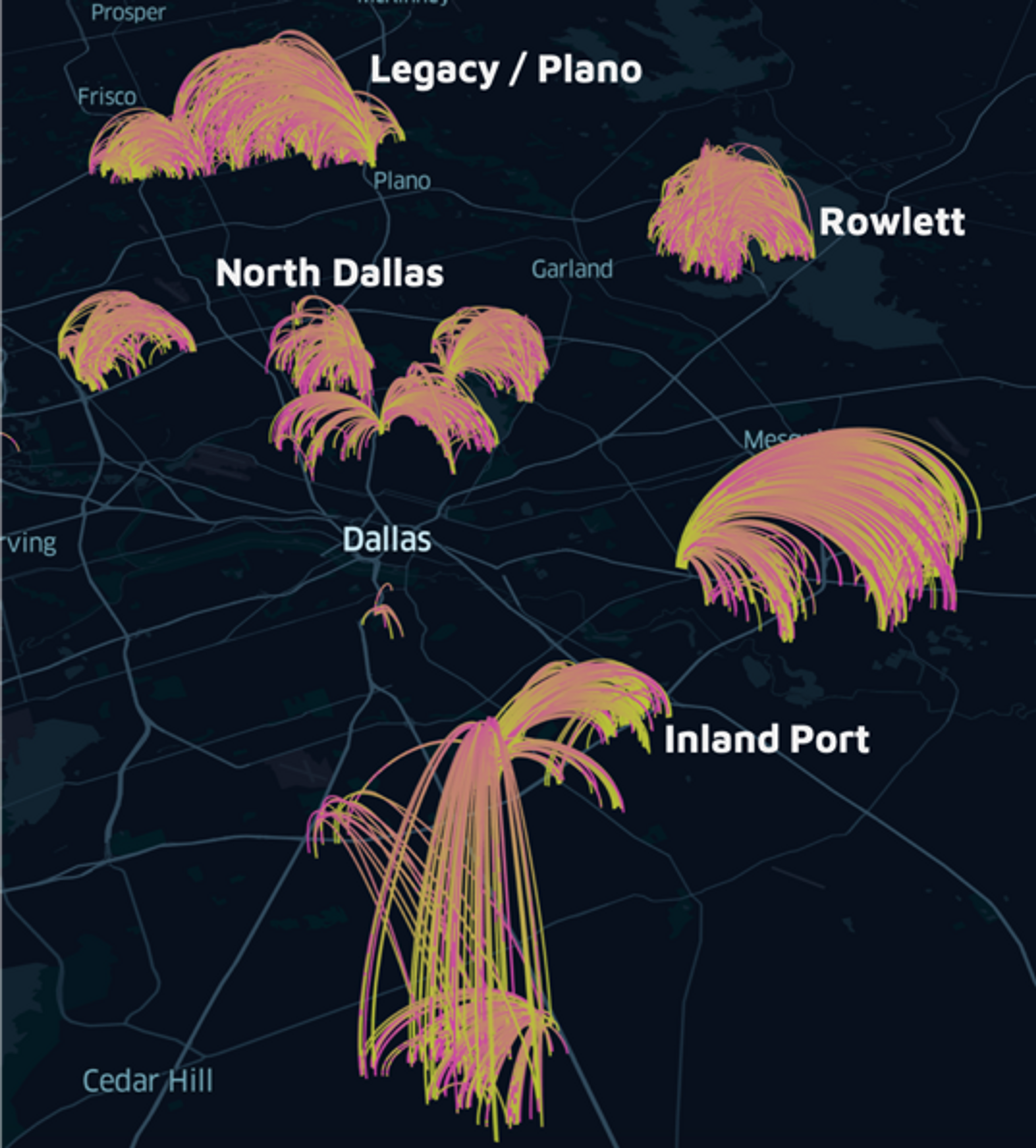
We concentrated our analysis on a handful of key zones in Dallas:
- Legacy/Plano: a wealthy suburb with rapidly growing housing developments and commercial areas;
- Inland Port: a commuter service for workers travelling to and from an Amazon warehouse;
- Rowlett: a large suburban area;
- North Dallas: a typical mixed-use neighborhood.
A 2-hour walk to the nearest bus stop
By overlaying the locations of all GoLink trips onto fixed-route bus and train lines, we found the majority of trip requests occurred in areas with little or no public transit. For instance, in parts of Rowlett and Legacy/Plano, riders making microtransit requests would have to walk up to 2 hours to reach their nearest fixed-line bus stop.
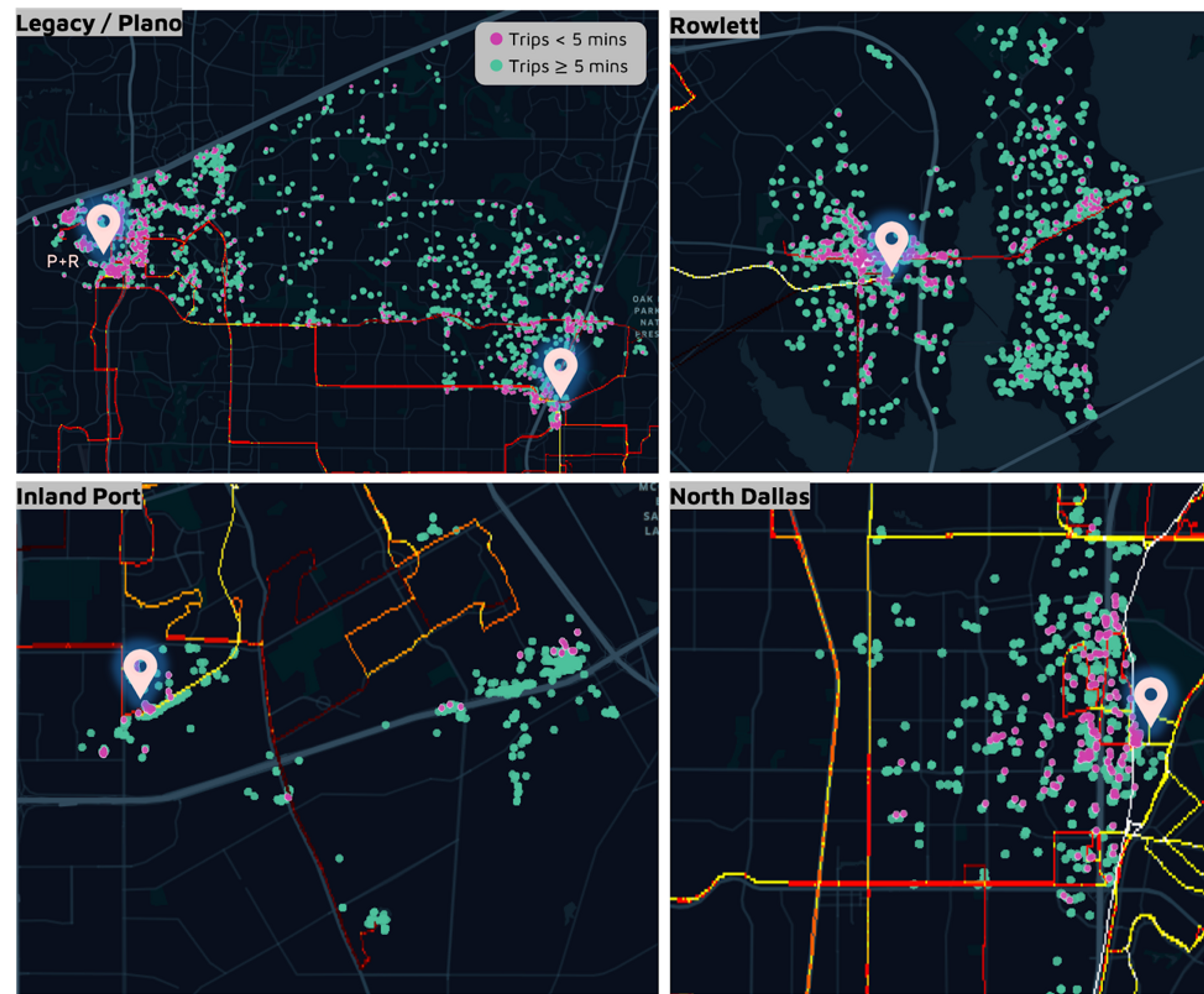
Mismatch between fixed-route transit and demand for microtransit trips. Dots show microtransit trips taken on GoLink. Red/yellow lines show existing transit infrastructure (yellow = frequent service, red = infrequent service). Icons show main anchor transit stations.
The density of short (<5 mins) trips around the anchor stations suggests microtransit is often used as a convenient first mile/last mile solution to connect with DART’s main fixed-route stations. But has microtransit had an impact on the wider transit network?
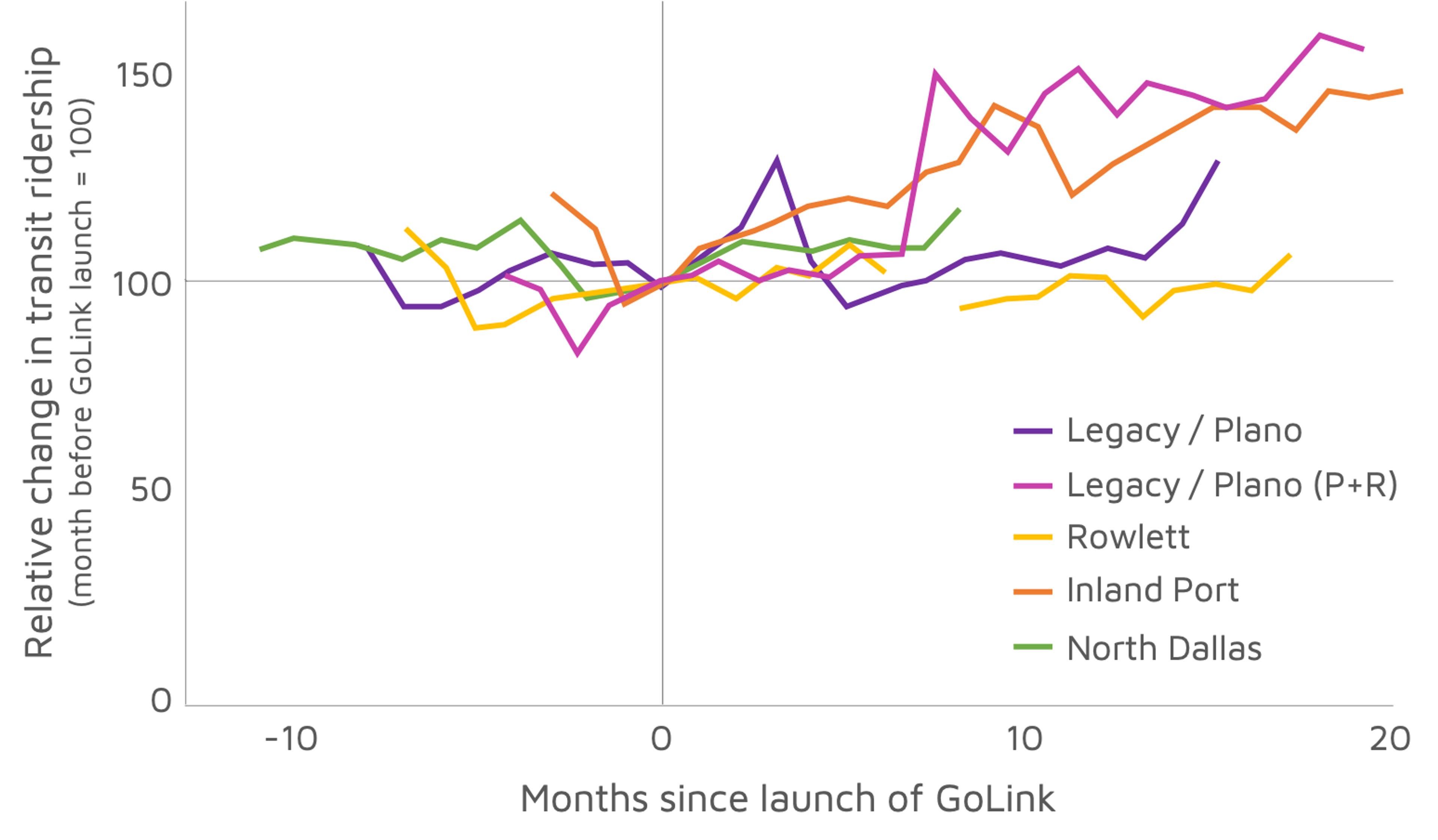
The resounding answer: yes! Anchor stations in all zones except Rowlett experienced ridership growth under GoLink, most of them in a statistically significant way.
This suggests that riders are increasingly using microtransit to connect with main transit lines, which contributes to a thriving multimodal transportation system.
Change in average weekday ridership at the main anchor transit station of each microtransit zone. All data are normalized (=100) to ridership in the month preceding launch in each zone.
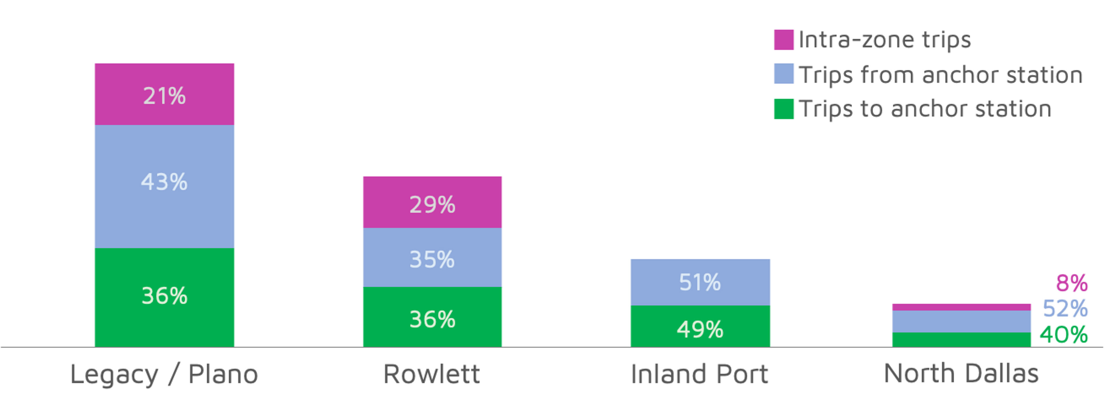
We used the precise trajectories of trips to categorize them as either ‘transit-connecting trips’ or ‘intra-zone trips’. Transit-connecting trips made up the majority of trips in all zones. But the profiles of commuting zones (e.g. Inland Port) are very different to those of residential neighborhoods (e.g. Legacy/Plano, Rowlett). This helps agencies to tailor their transportation strategies to the trip types that dominate each zone.
Your signature here, here and here
To dig deeper into characteristic trip types and patterns, we turned to more sophisticated techniques.
We applied an algorithm called DBSCAN (using G. Boeing’s helpful code) to group thousands of individual trips into a few hundred clusters of pickup or dropoff locations. Then, we used a machine learning method known as ‘self-organizing maps’ (SOM) to identify a handful of signature patterns showing how trips are distributed across the day.
By matching the travel times from each common location to the most similar signature in the SOM, we pinpointed hidden patterns in our microtransit data.
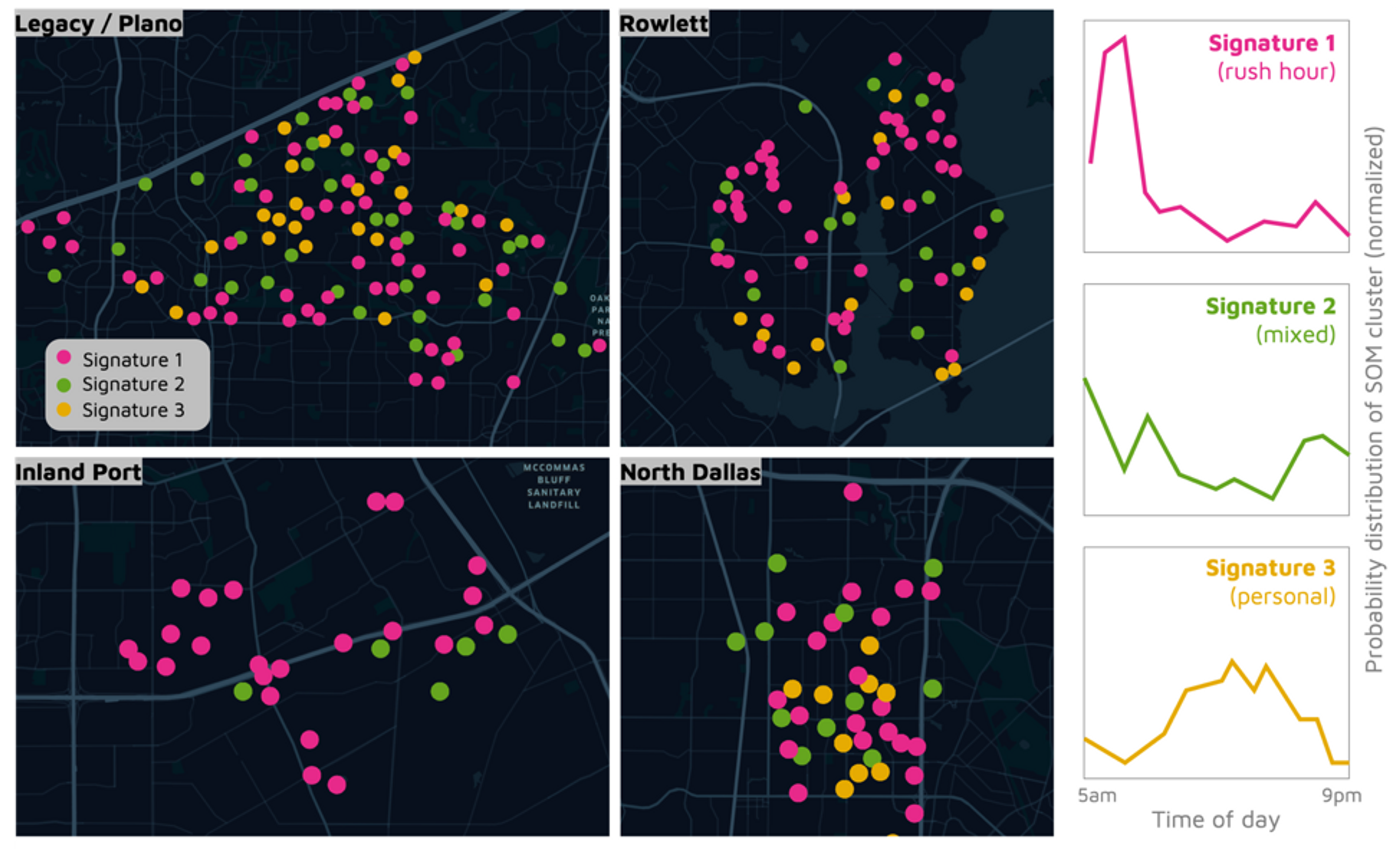
Mapping time signatures from the SOM to each cluster of trips.
The three distinct time signatures are shown above. Signature 1 corresponds to rush hour travel, with a strong morning peak; Signature 2 corresponds to a mix of rush hour and middle-of-day travel; and Signature 3 corresponds to recreational travel, with a single peak around midday.
Maps like this are exceptionally useful for decision-makers to ‘join the dots’ between areas that require different service types.
Finally, we used data on the variability of trip timings to identify the most sensible way to lay out a fixed-route system.
Areas where people regularly take trips at predictable times – in other words, where timing variability is low – are best suited to fixed-route transit (blue hexagons in the map below). In contrast, it might be more appropriate to run a microtransit service in areas where demand is intermittent and relatively unpredictable (red hexagons).
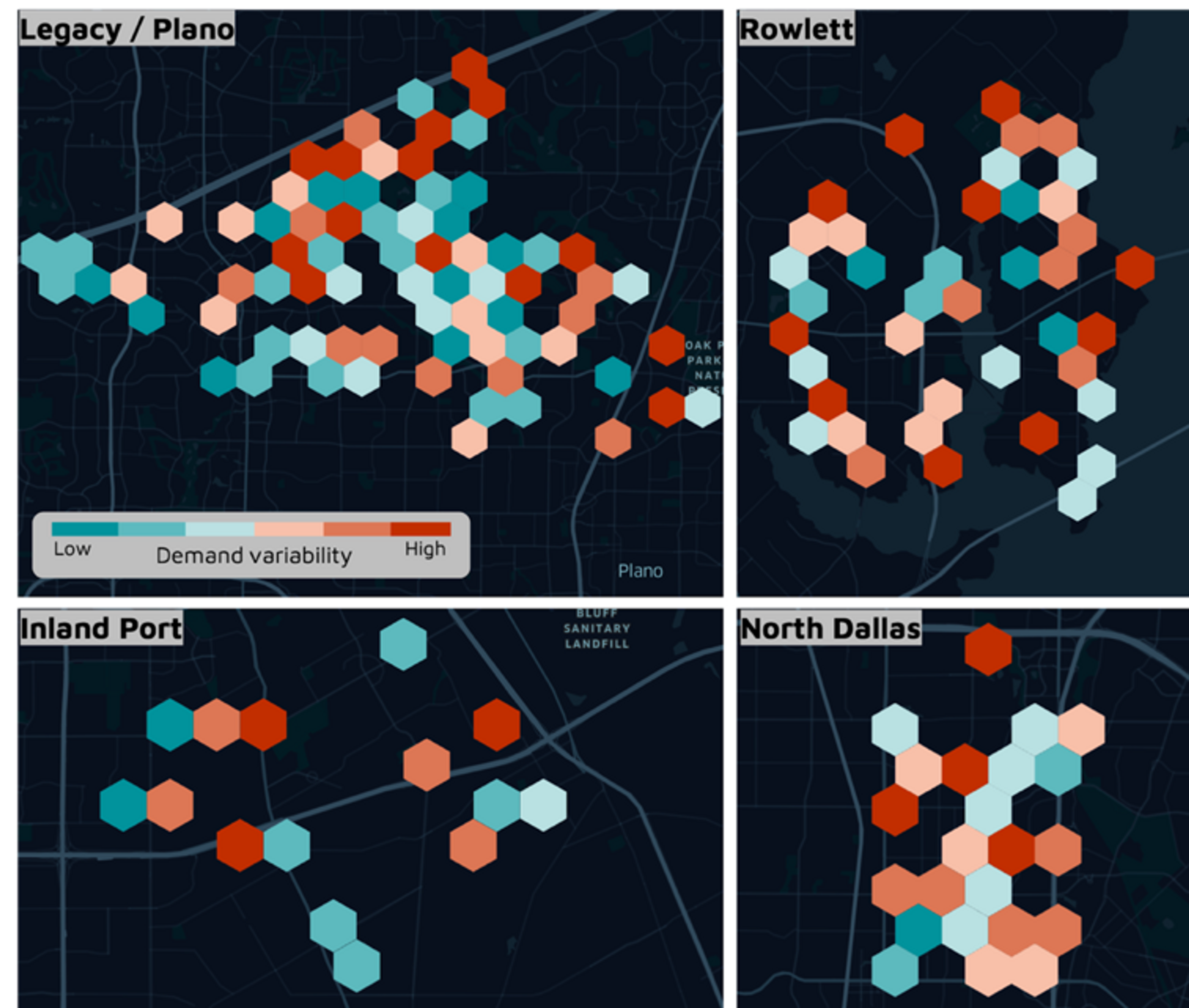
Now that we have uncovered where and when there is real demand for different trip types, we can redesign the layout of fixed-route transit. Read our final blog post to learn how we worked with partners at DART to use this testbed approach for transit planning!
To find out more about how Spare powers on-demand transportation of any type or size, don’t hesitate to get in touch with us at hello@sparelabs.com.